Mobile App UX/UI
Creative Direction
Project Leadership
Pliability, formerly known as ROMWOD, is a popular fitness app that fuses mobility, yoga, prehab, rehab, recovery, and mindfulness to help users improve overall well-being and athletic performance.
Prior to the company's rebrand, I designed a fresh new user interface across web, iOS, Android and tvOS, and created multiple cornerstone features, including Pliability's flagship Mobility Test.
Leveraging my background in human anatomy, I created a simple test protocol around the overhead standing and overhead squat positions, enough to analyze your essential range of motion and expose your potential movement dysfunctions.
For more comprehensive insights, I defined healthy ranges of motion for essential joints and thresholds from which to flag joint issues such as compensations.
The grayed out joints (elbows and knees) are considered secondary joints because they provide stability rather than mobility.
Despite its complexity, we needed the test to feel effortless, so I designed a simple and intuitive visual interface.
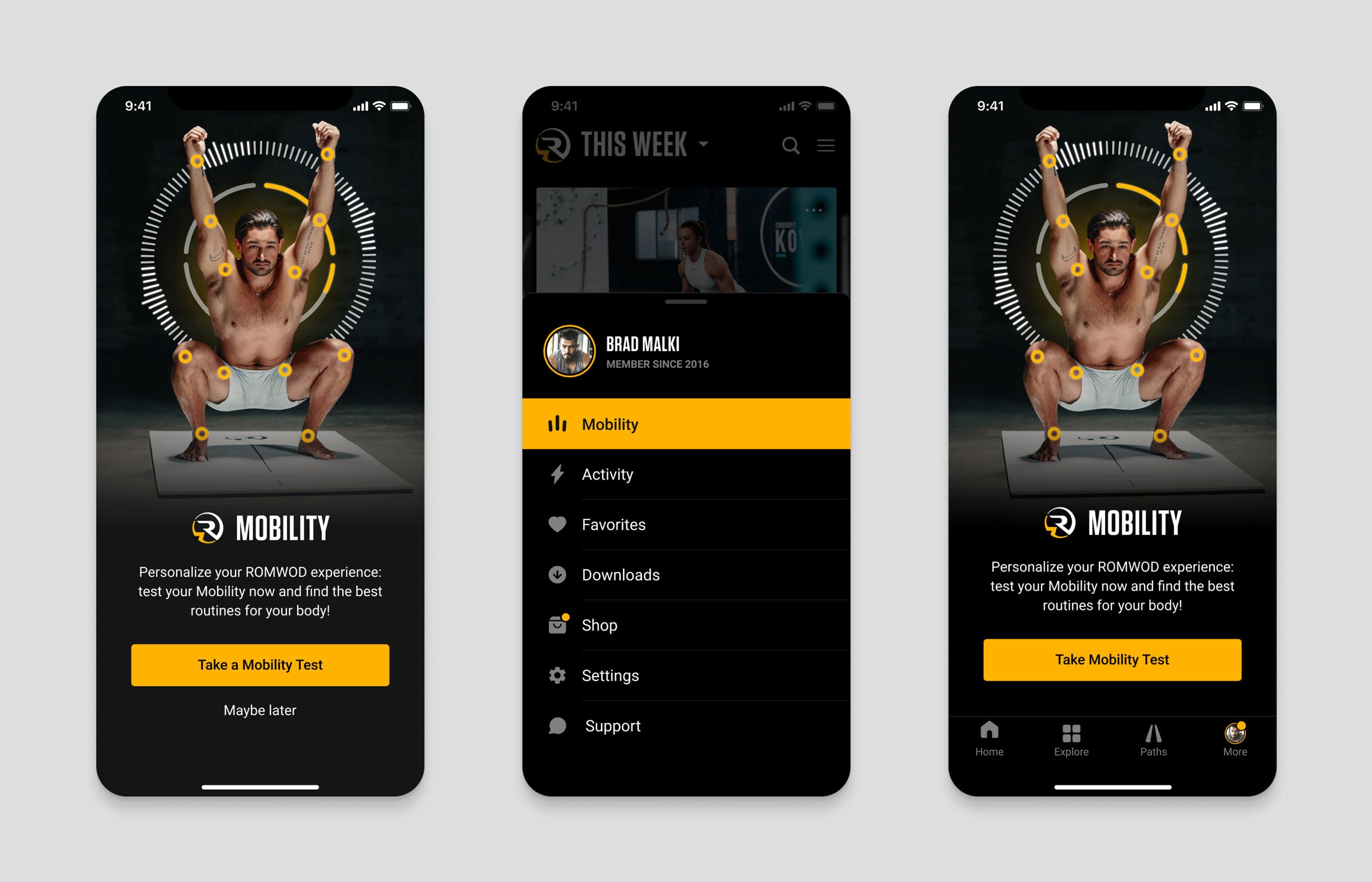
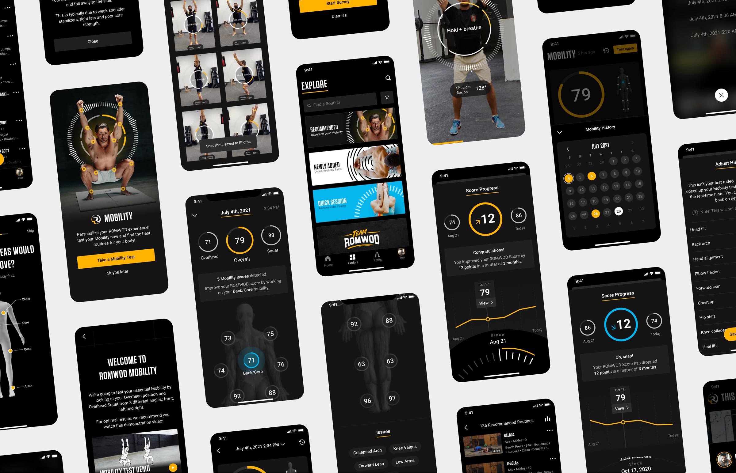
The full-screen teaser gives you quick access to the Mobility Test, while a new menu item allows manual navigation to the new feature.
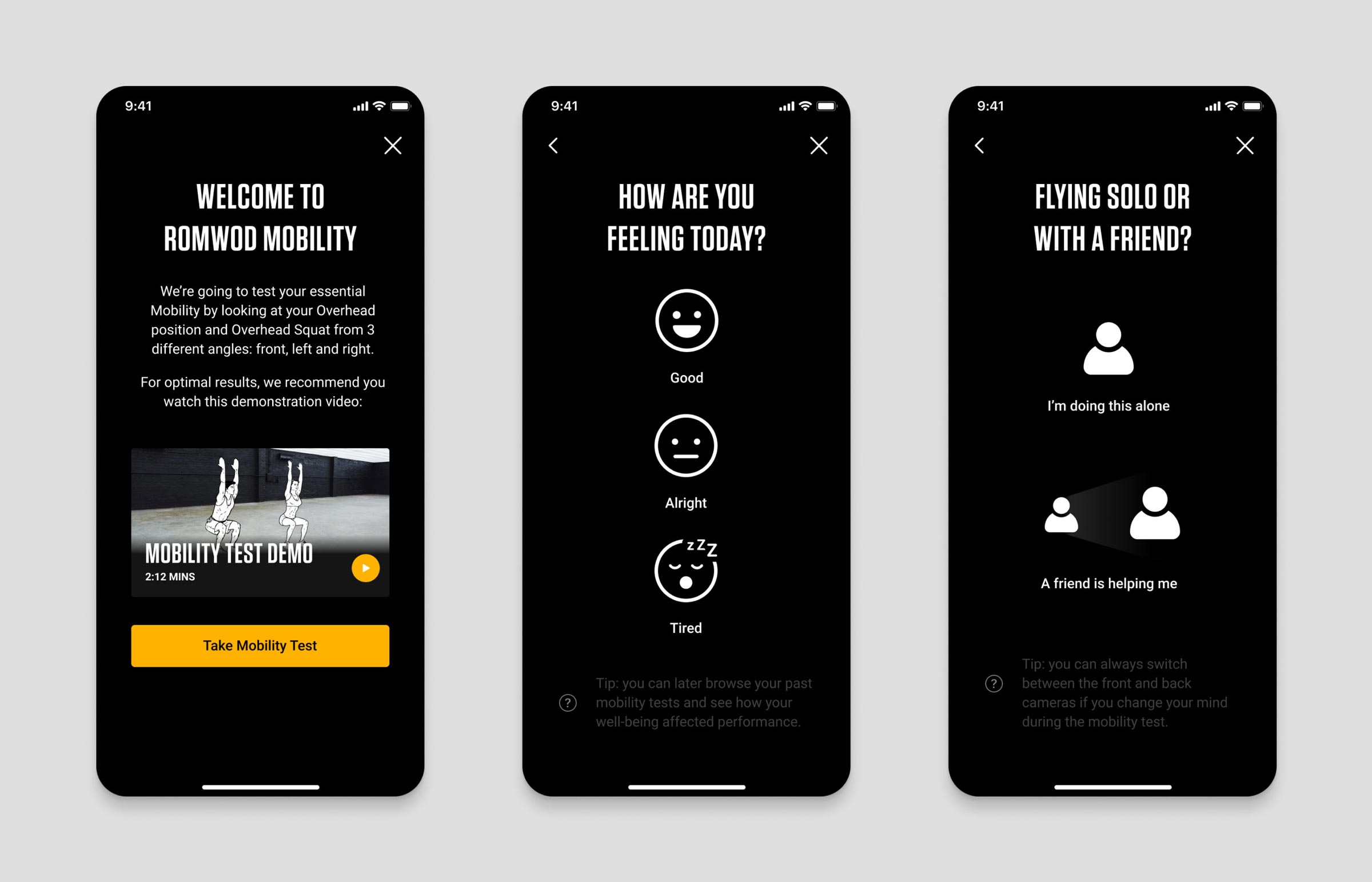
The first onboarding screen introduces the Mobility Test, aided by a demonstration video for which I wrote the script and directed.
The next screens collect valuable well-being data and give you two ways to take the test, depending on whether you are doing it alone or with the help of a friend. This selection informs which camera (front or back) is preselected for the test.
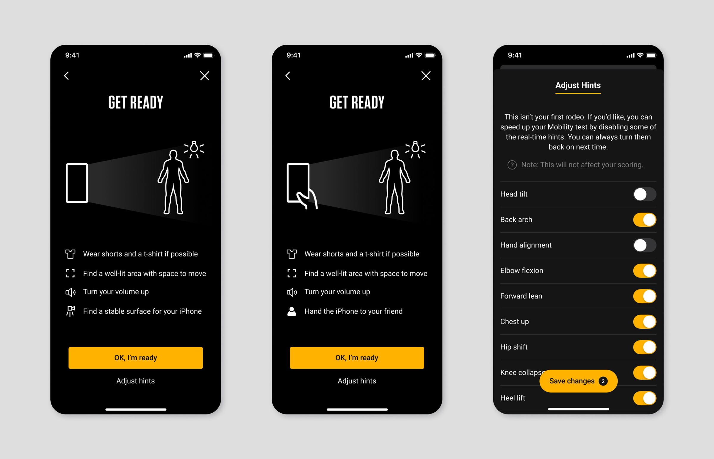
The "Get Ready" screen, last before the test begins, offers crucial tips to optimize results, as well as offering optional settings for recurring users who wish to further customize their test experience.
I also created an uplifting human vocal interface which guides you step-by-step, providing useful hints to move from position to position and interact with your device.
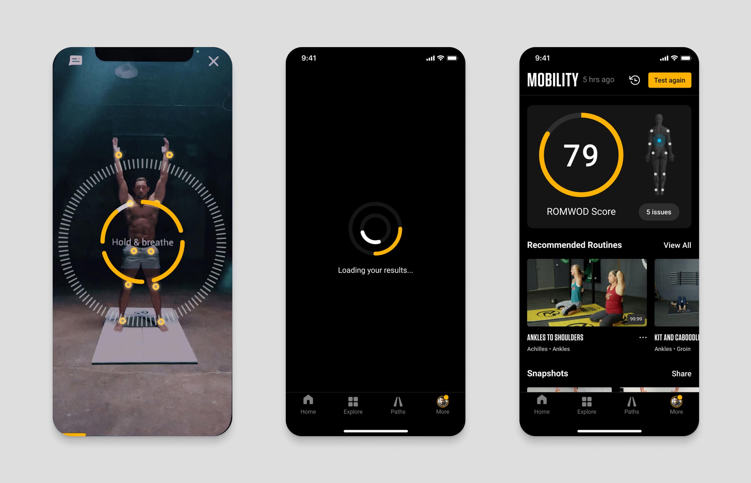
Visual design patterns evolve as the test progresses, providing real-time feedback that your body is recognized and being analyzed. Audio and visual cues make the experience not only accessible but absolutely immersive.
As rich and interactive as it is, the Mobility Test takes only 3 minutes to complete, after which an animated loader augmented by sound effects builds anticipation in advance of discovering test results.
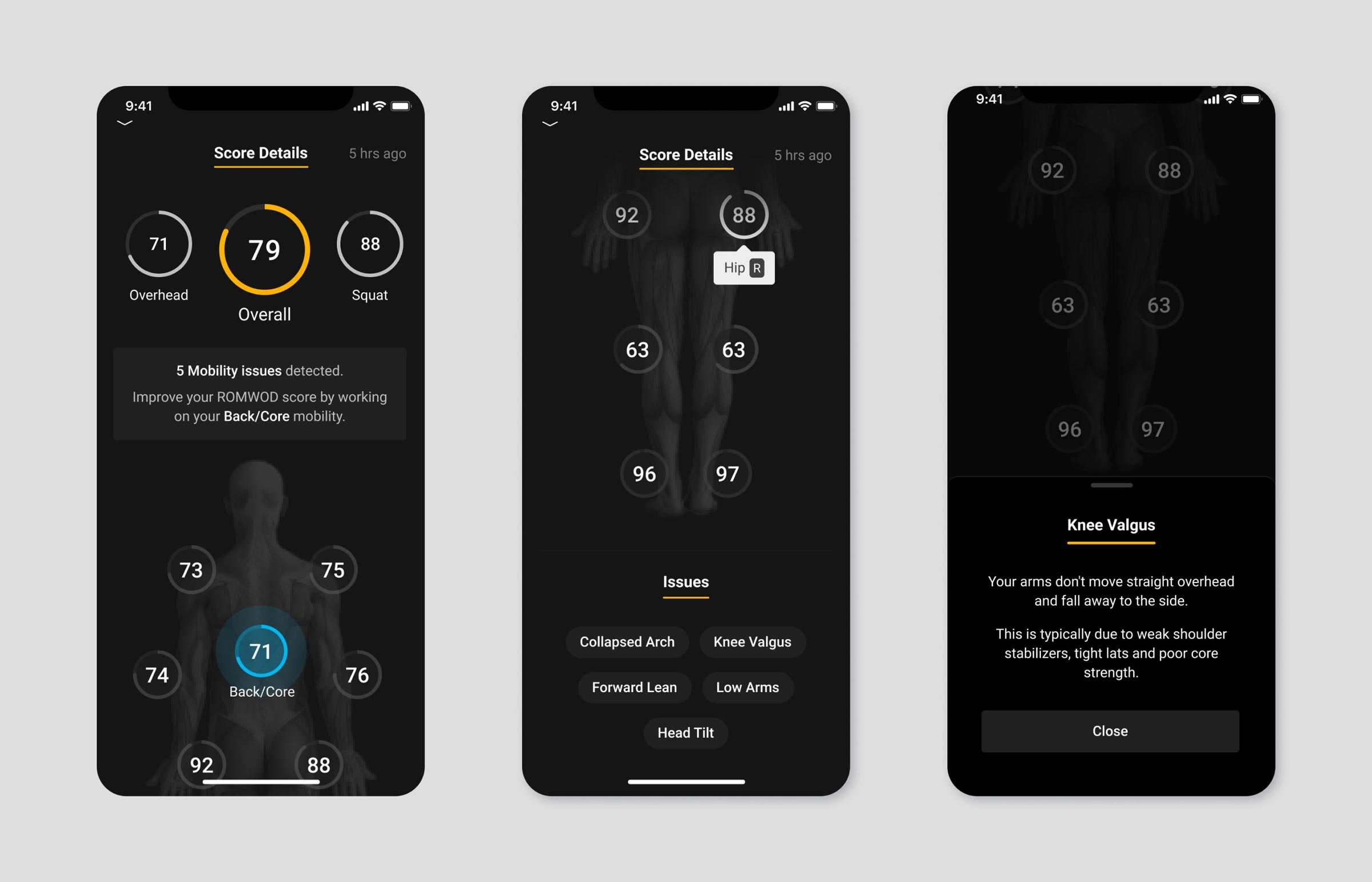
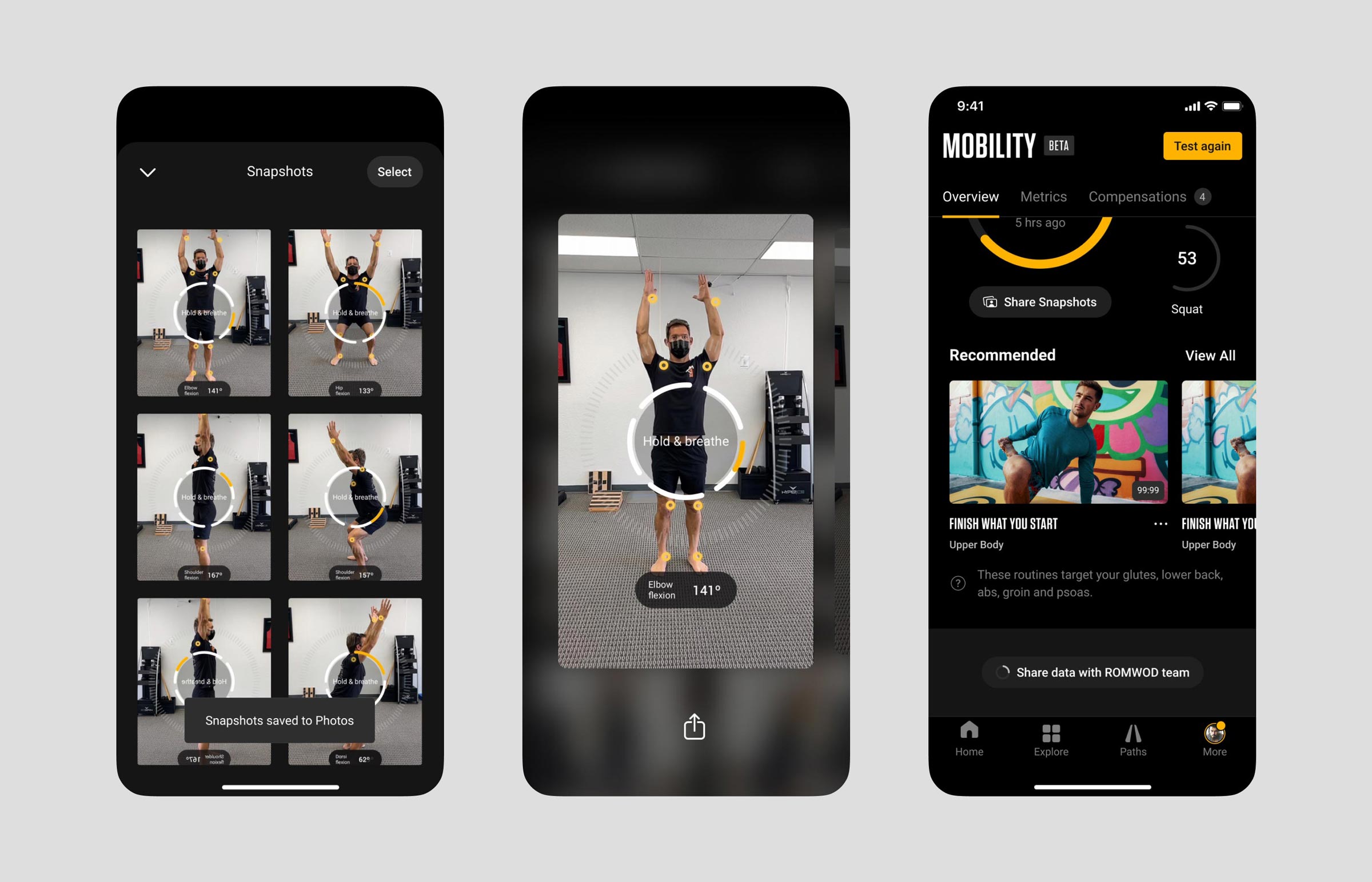
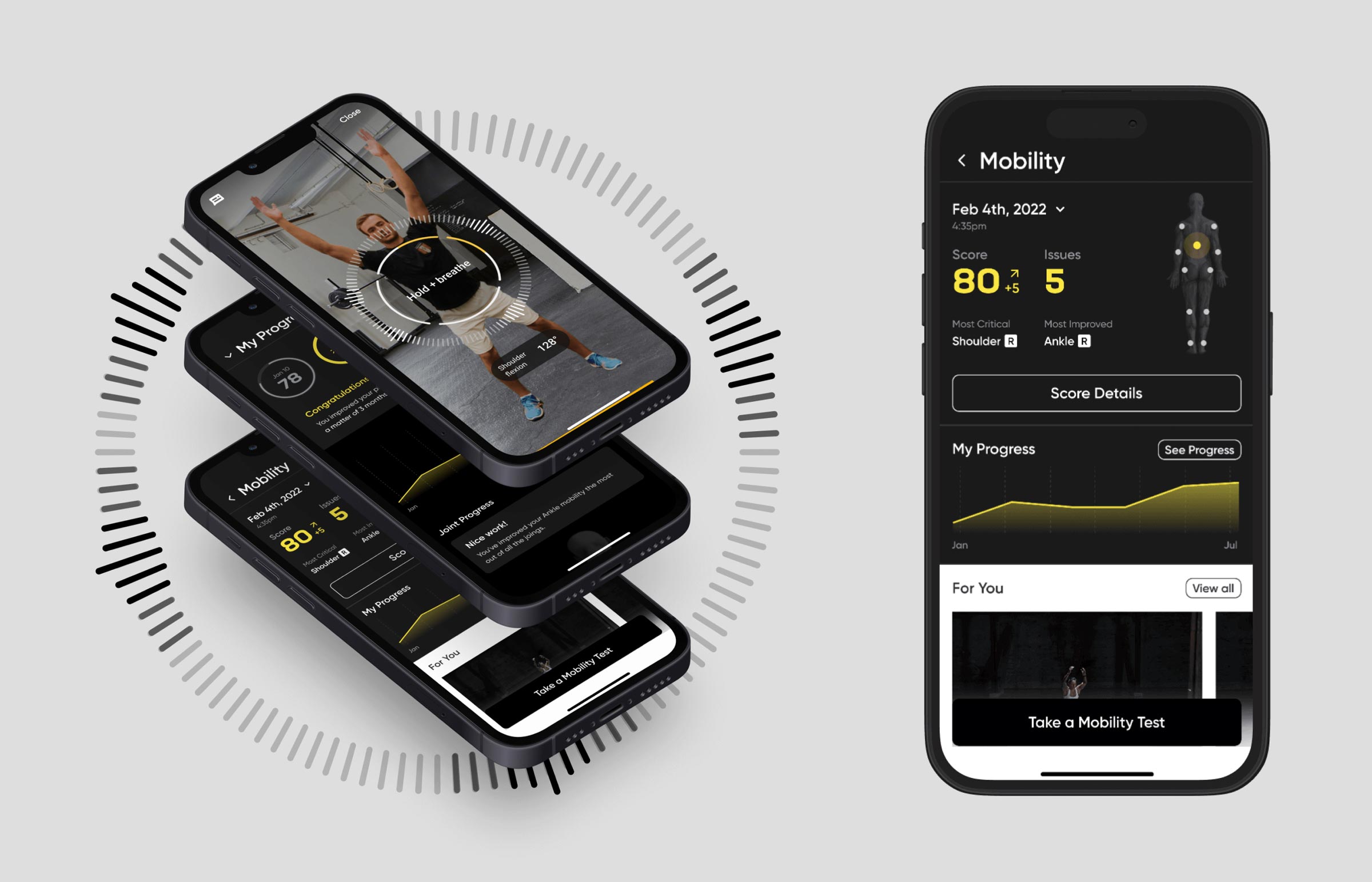
The results screen features the score overview, with the overall score and a preview of problematic joints and detected issues, the feed of recommended routines, and the snapshots taken during the test, which make it possible to review your body position in hindsight.
The results identify any dysfunctions in specific movement patterns, so instead of attributing tight hamstrings as the issue, the results indicate movement dysfunctions in the hip, ankle, or other primary joints. Tight hamstrings (for example) may be a symptom, but not the underlying cause.
The grayed out joints (elbows and knees) are considered secondary joints because they provide stability rather than mobility.
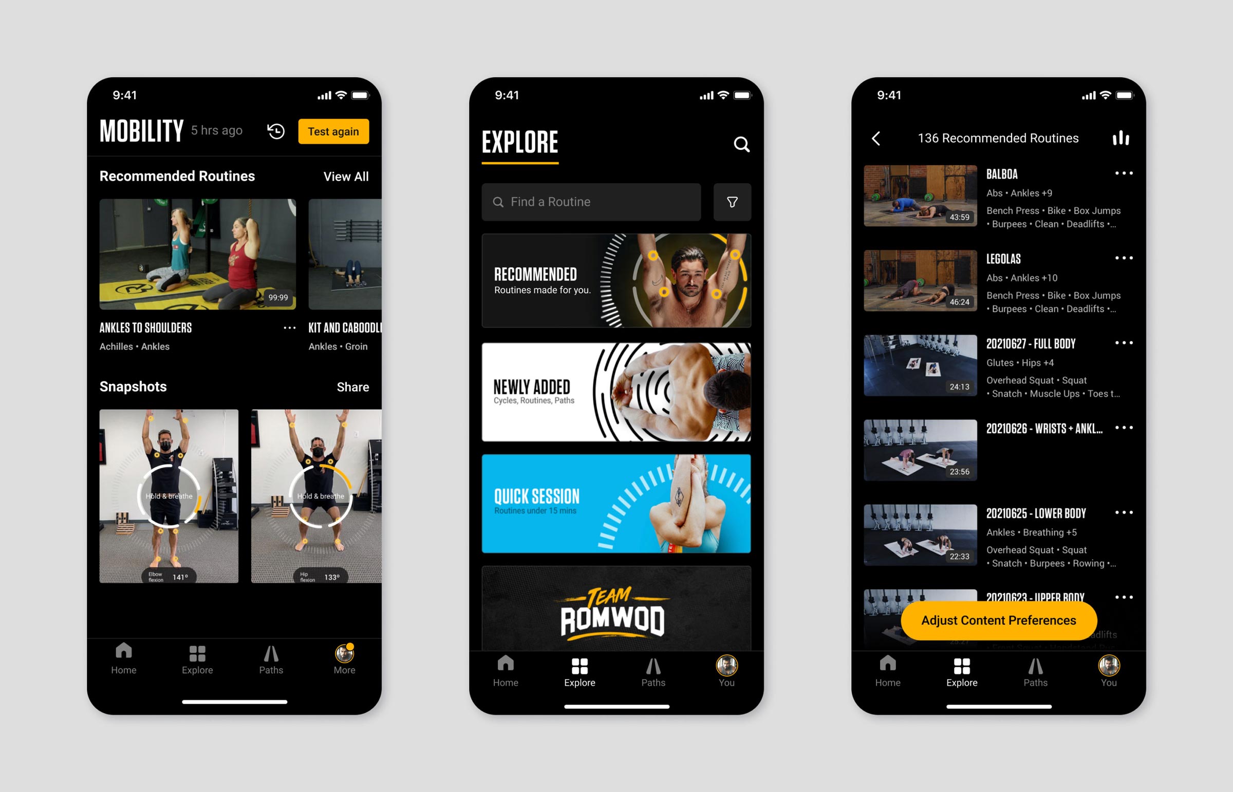
The feed of recommended routines lets you quickly jump into a routine and improve your mobility. A dedicated content card gives you access to this this feed from the Explore tab as well. Content preferences can be adjusted to fine-tune your recommendations and filter out unwanted videos.
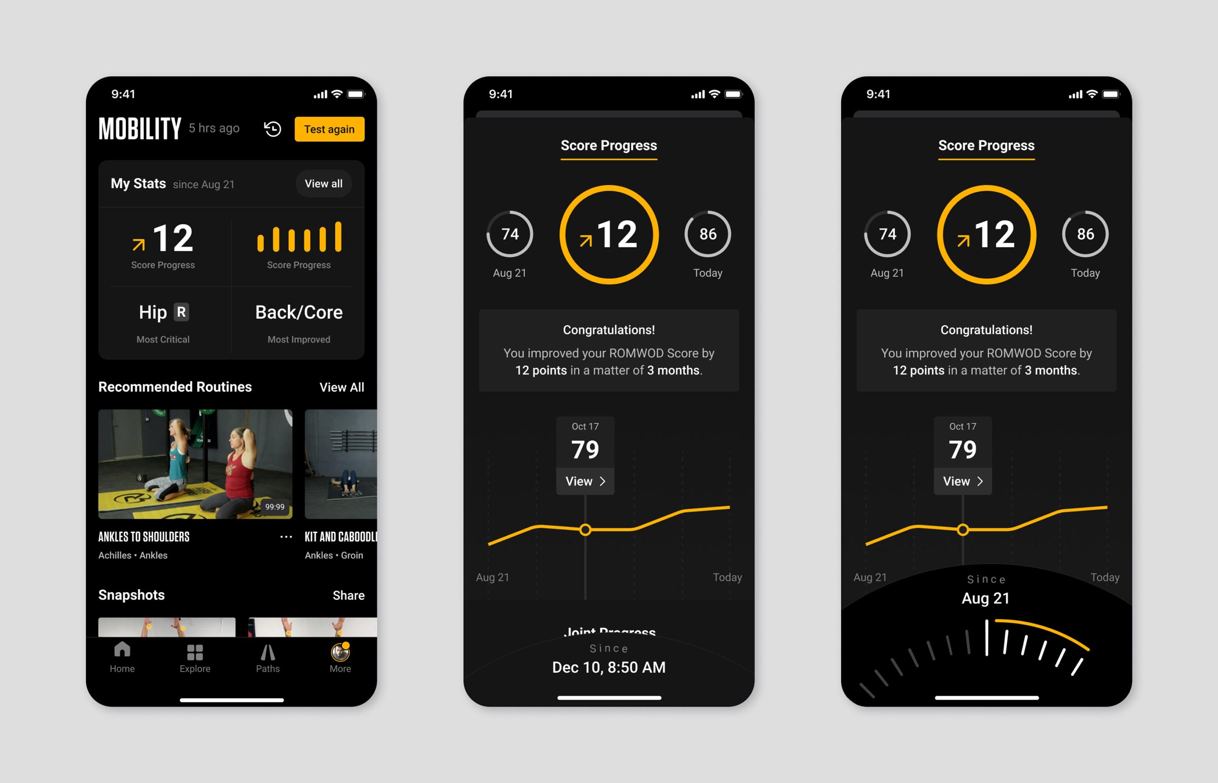
The scorecard on the results overview can be swiped, giving you access to your mobility stats card. This summary of stats provides an indication of your progress, the most critical joint, and the most improved joint over the last six tests.
Tapping the stats card opens up the full stats view, where you can select two dates to draw stats between and start diving through your data.
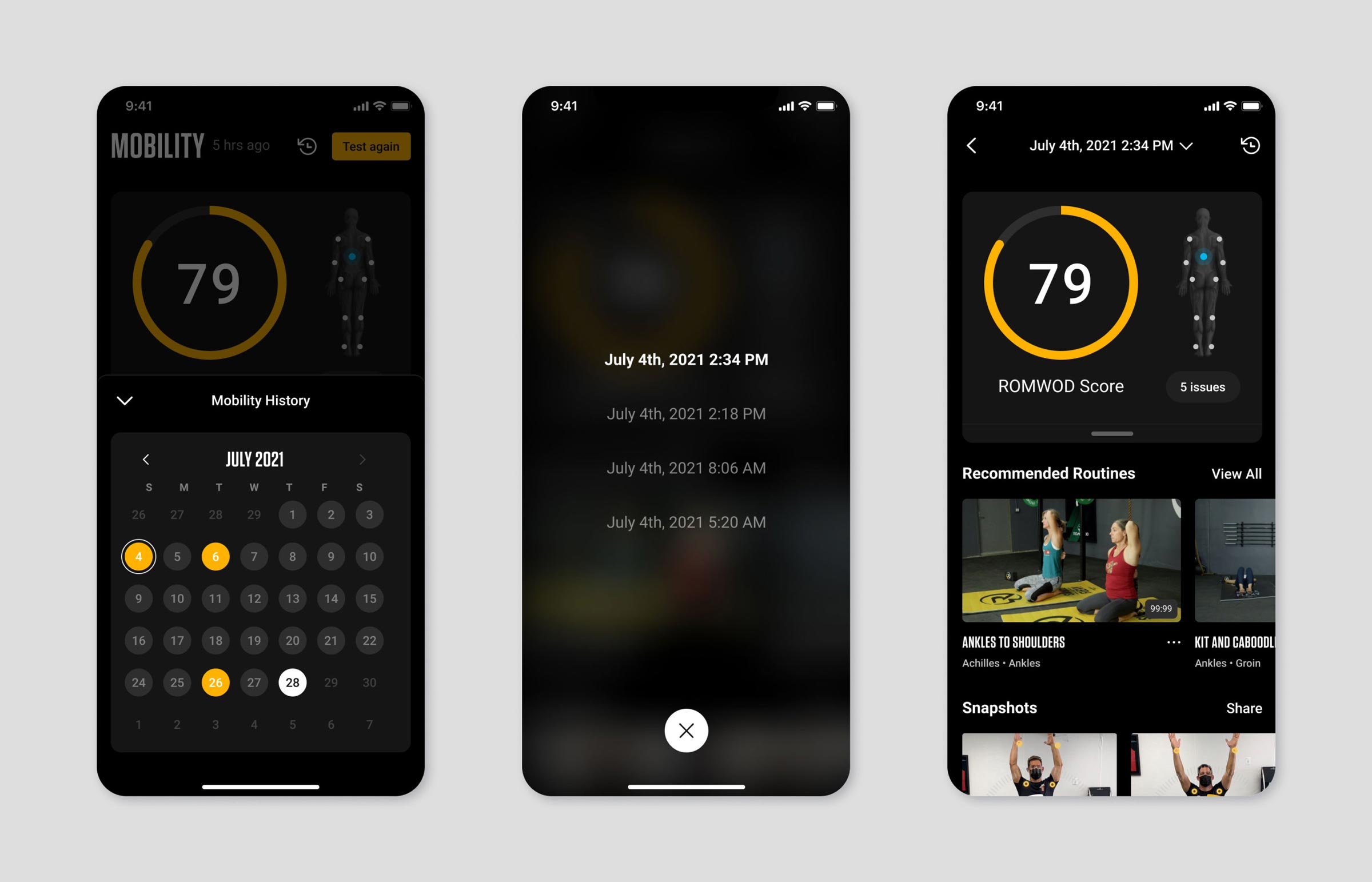
The history feature makes it easy to review how consistent you have been, and allows you to swiftly jump back into a past assessment to compare scores and data.
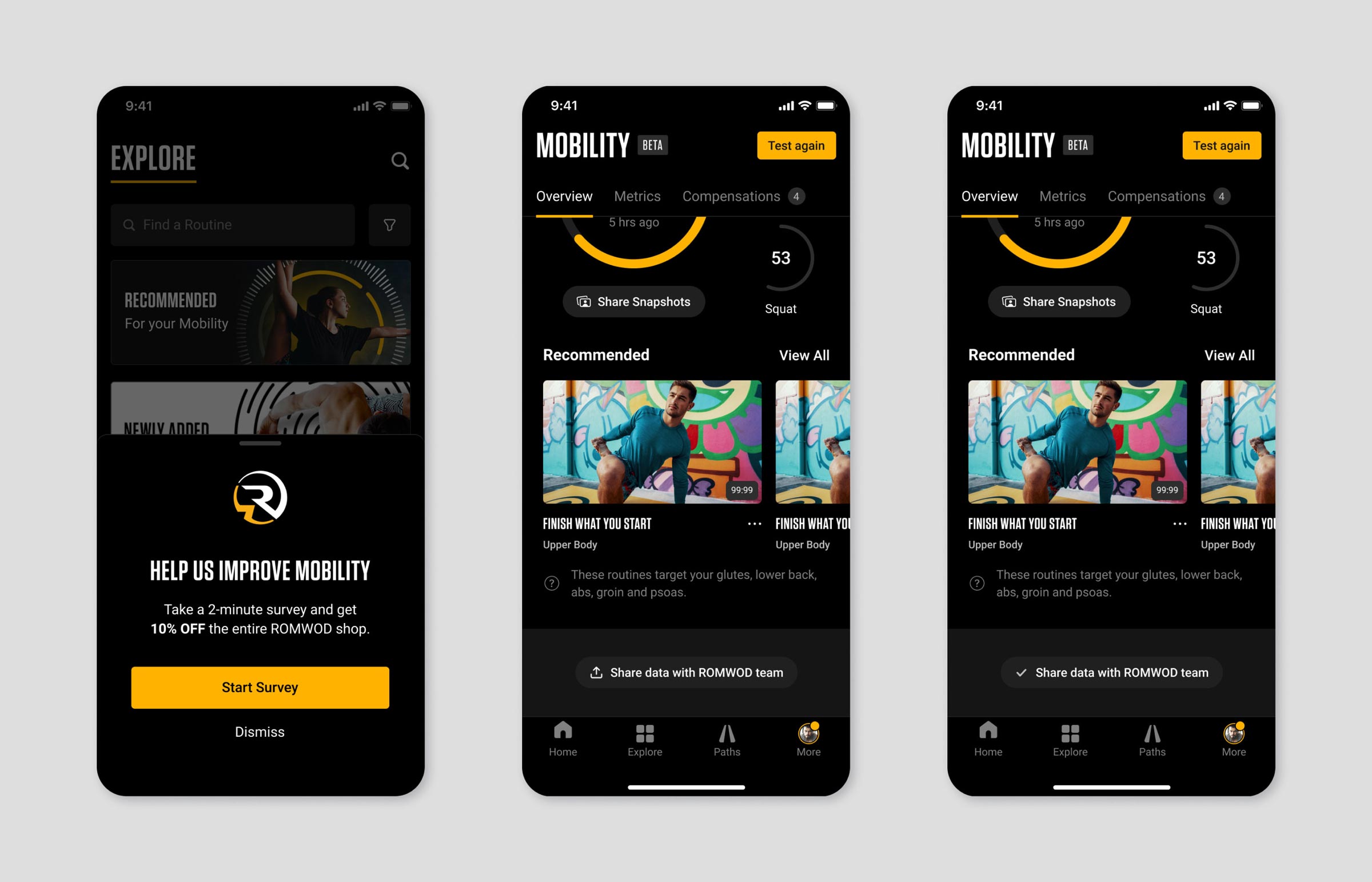
I designed a survey to gather critical feedback from users, linked to Airtable for data analysis. The feature was exceptionally well received by users and our roadmap revealed to be ideally aligned with their needs.
This survey also helped us troubleshoot user issues and gauge their desire for new features, while the debug mode allowed us to collect their biometric data, videos, and snapshots for a more in-depth analysis while alleviating with personal data concerns and complying with regulations.
As we collected vital data and further improve the Mobility Test, we made the feature available to an increasing number of users and devices.
Thanks to the success met by the Mobility Test with Pliability users, we were able to grow our team and welcome among others Jonathan Pierce of Kinetik Performance, a sports scientist who regularly works with top tier professional sports teams and athletes across the nation.
With the help of our new teammates, we were able multiply our testing efforts and further refine the Mobility Test to focus results on a holistic kinetic chain analysis to diagnose potential issues with critical insights into their movement patterns.
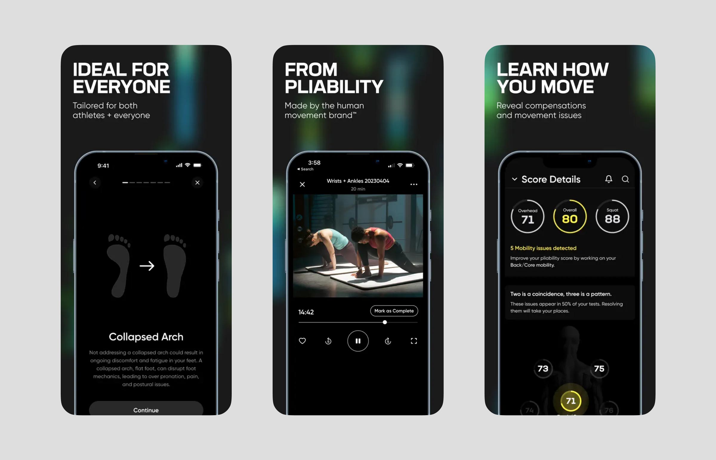
In September 2022, Pliability (then ROMWOD) unveiled its new brand developed in partnership with Deceptive to serve a broader audience beyond its functional fitness roots. New York agency Utility led the charge to carry over the new visual language across the app ecosystem.
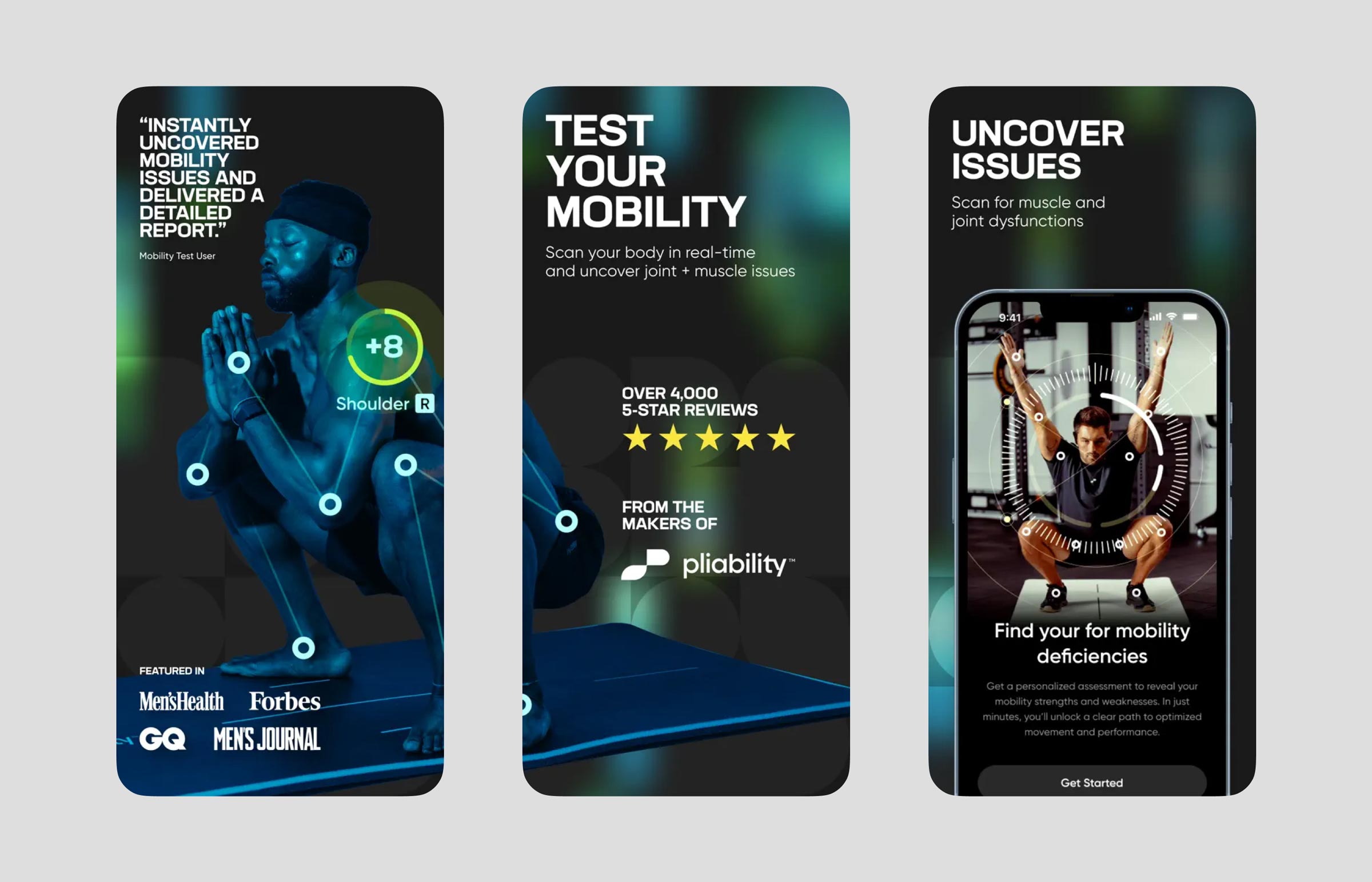
To this day, Pliability's Mobility Test has endured the test of time and remains the crown jewel of the app, as well as a central part of the product site, with the user experience largely unchanged.
The ground-breaking feature has been celebrated across the industry by every day users and elite athletes alike, from Crossfit practitioners, to pregnant women and professional golfers.
In April 2024, Pliability released a stand-alone app devoted to the Mobility Test, further cementing the crucial role it has played for the company since its inception.


